There was once a time when product designers used to think that the tippy top of a web page was the best real estate available. User behavior data supported this notion. Then users adapted. What did they adapt to? Banner ads. As top-of-page banner ads became the norm, banner blindness kicked in and users glazed over that once-prime real estate. Thoughtful designers recognized that they needed to rethink this tried and true tactic. They accounted for banner blindness by creating new types of page layouts.
Product designers must continually rethink what they know about how people interact with software and the web because a user’s behavior will continually change.
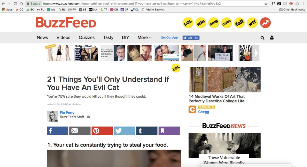
The world has long held tight to the notion that too much scrolling is bad. Why make the user hunt? But as expected, behaviors have evolved. Users now know that very often, everything above the fold is just the beginning, and that often the real beef is found below. The evolution of media content has shown an emergence of small snippets in list form (listicles, if you will) popularized by outlets such as Buzzfeed. Why would a user linger on this web view of 21 Things You’ll Only Understand If You Have An Evil Cat when all you really want (or need) are the 21 things? You are going to immediately scroll here, because you can’t even see the image for the first thing. The same is true in mobile view. This captivating content is not stuffed above the fold so you can see it all without scrolling. Users are molded by this behavior. With this as a current trend, users have become unable to even look above the fold very long without scrolling.
Want to see some evidence? Here’s heatmap proof from Tony Haile of Chartbeat:
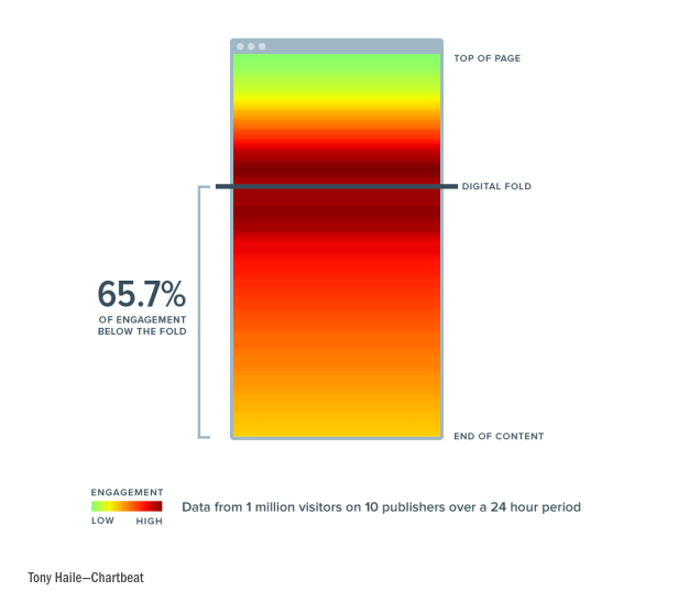
The fold is the hotspot! It’s where the action happens! Where the intro reveals itself into the good stuff.
In fact, less content above the fold may encourage users to explore deeper below it.
According to Paddy Donnelly, the “above the fold” concept is widely misinterpreted in the digital world. Too many people think that all good content needs to fit above the fold. “Imagine if a newspaper squashed all of its quality content on the front page. How disappointed would you be to open the paper to only find the leftovers? If everything of exceptional quality is pushed upon the reader at the beginning, once they start exploring and find that the rest of the site isn’t of the same caliber, they’re going to be let down.”
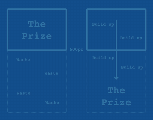
However, keep in mind that the fold is not one set location. It varies widely depending on screen size. Trying to pinpoint it in order to drive design decisions is a waste of time. Instead, allow content to flow without an assumed cut-off location. But won’t that lead to partially viewable stuff? YES! And that’s a good thing. Partially viewable content is a visual cue to a user that there is more substance—below the fold, accessible by, you guessed it: scrolling.
What’s surprising to some is that users don’t even need a visual cue to initiate scrolling. Design agency Huge found in their cleverly named study “Everybody Scrolls” that 91% of all users scrolled immediately upon arrival despite the way the content was presented above the fold.
Building a digital product?
With that data, designers should consider that most users will scroll even before they read. Haile notes most people who click don’t read: “A stunning 55 percent spent fewer than 15 seconds actively on a page.”
Wait, has it been 15 seconds already?
Don’t go! I’ll wrap it up!
Reducing the content above the fold and expecting users to glaze over it with minimal reading goes against most of what we used to believe is true. But that’s why designers must always be examining changing user behavior—so that we can keep users engaged as they adapt to new trends. Since we know users won’t read but will scroll, don’t try and cram all of of your content high up on a page layout. Make life easier for them by dividing it into sections with helpful headers for easy scanning. If you’re able to apply this thinking to your designs and provide your team, clients, and bosses with your perspective on it, you’ll increase your chances of staying one step ahead of your user.