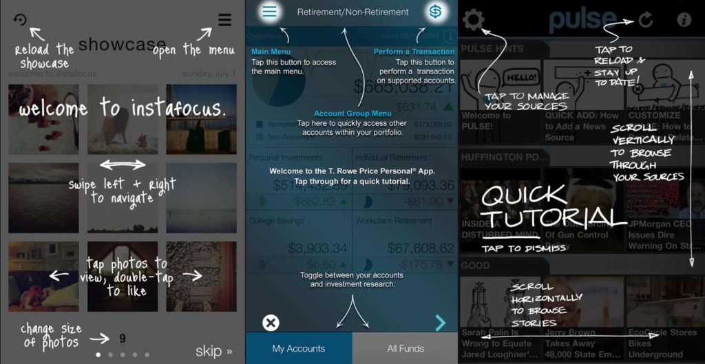
“UX is like a joke. If you have to explain it, it isn’t that good.”
Have you heard this quote before? There is a good reason for its relevance. Excess explanation is a sign that your design is not intuitive. It is not intuitive because you did not understand your customers needs. Good UX design must start with an understanding of your user and what task they need to accomplish. If you can define that, you can make accurate decisions for what they need to see and when, and not over-clutter your design with all of the possibilities at once. Excess clutter causes confusion, and instructional overlays are a band aid for confusion. And guess what? No one actually reads the instructions. People do not launch an app to spend time learning. Expect users to want to jump right in and design for that.

So How Do You Avoid Explaining Your Joke?
Use tried and true UX patterns and don’t try to reinvent the wheel. For example, using unfamiliar icons for widely understood things like “settings” and “menu” or switching menu to the right side of a product and account settings to the left would almost certainly create friction—and that can frustrate a user. Users are accustomed to certain layouts and structures. Those conventional designs are popular because they work.
Present the most important actions up front. Hide others that are not needed until later. Only present what is useful and relevant at specific times in the interaction. Also be consistent with navigation so that your user can sense where they are and how to get back to any given location at all times. This gives them the confidence to explore and find things naturally without the fear of getting lost or breaking the app.
Do your research. Watch your users going about their normal everyday tasks. Identify what they find challenging so that you can improve their workflow. The knowledge you gain by directly observing your user-at-work will allow you to make more informed decisions throughout your design process. You will likely learn something that the person would not even think to bring up or ask for.
Start your design process with the content structure. Content is the foundation of the design. Any kind of visual polish should happen last, as it distracts from the important task of creating the layout and flow, which must happen first to ensure the experience is catered to the user and their task at hand.
Expect your user to explore on their own and provide helpful information in places that might start off with no content. This is a great way to educate your user at a time when they are really paying attention. Airbnb does a great job of quickly on-boarding and providing helpful tips within each feature.

Building a digital product?
Rethink the Need for an Instructive Overlay
In most cases, your user already knows what the app is for. They’ve got the basics of how to use it already. What makes you think you are confusing them? Is it not intuitive as to where to tap first? Is it unclear on how to perform a specific task? For many of these challenges, the solution doesn’t have to be a long walk-through or complicated overlay. It can just be a better design. A better layout. A better sign-up flow. Ultimately a better experience.
Simplify, streamline, and don’t always assume all of your users are beginners. With the right understanding of their needs, you can create something enjoyable for a user of any skill level. Designers may not always make the best comedians, but they do make products straightforward, elegant and delightful. You want your users to ‘get your joke’ with an understanding smile on their face. Subscribe to Product Hacker and get original and even exclusive product design, development and management insights and inspiration like the one you’re reading now in your inbox once a month, for free.


